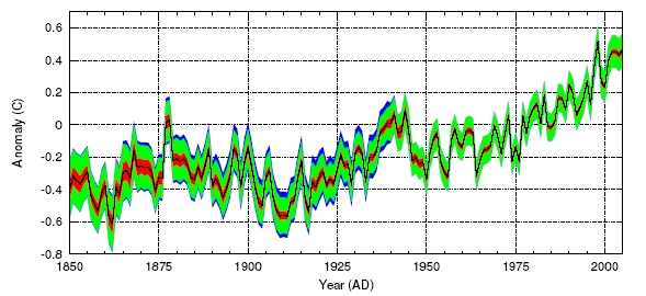
Here is the HadCRUT3 global temperature dataset for the same period at annual resolution; the solid black line is the best estimate value, the red band gives the 95% uncertainty range caused by station, sampling, and measurement errors, the green band adds the 95% uncertainty range due to limited coverage, and the blue band the 95% bias range due to bias errors.
Bias errors are urbanisation (the 'heat island' effect) and changes in thermometer exposure protocols over time. They have taken an urbanisation bias value of 0.055 C per century for their land values, which seems to be a consensus value. Some researchers they cite (i.e., not fruit loops) claim this may be as high as 0.3 C per century, but this figure incorporates both land and sea data so is not likely to be out by as much as that.
Here is my quick and dirty correlation of the two graphs above, with one data point every five years:
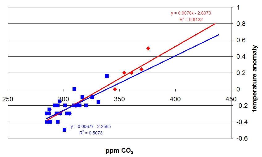
My naive extrapolation of graph (1) and graph (2) suggests that the mean global temperature ought to be bopping up and down one side or another of 0.0-0.2 degrees above today's mean c. 2030.
14 comments:
I've forgotten what your exact stance is - why exactly are you advocating that nothing be done about global warming?
I mean, I recall that you had a point, but some months on it has completely failed to remain registered in my brain.
Here is me post from a while back. Like our management is always telling us just before they sack a bunch of people: see change as an opportuity, not a threat.
well, an opportunity, not an opportuity, but you know what I meant...
However, the point of the graphs is that if we take a strictly proper view of the data, the standard deviation of the average temperatures is a chunk greater than the expected rise over a thirty year period.
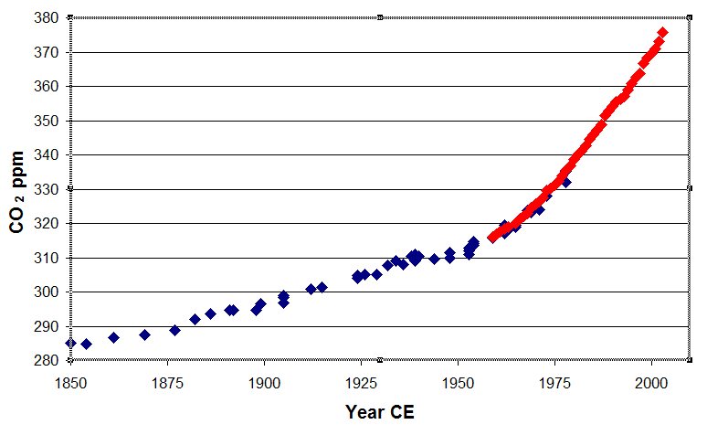
Ayup! I should have said- and in fact I did, in the first two attempts to edit this post that were eaten- that the blue points on the third graph are 1850-1980 and the red points are 1980-2003.
Would *you* build 25 nuclear power plants on the basis of these graphs? I wouldn't.
(Memo to self: Try not to go overboard in attempts to elicit responses from Androoo)
I don't want a considered response! I want ir-response-able commentary. Plus, I have criticisms of your precious "real" climate.org. They have promoted the view that scientists know better than economists about future temperatures. In fact the business of predicting future temperatures bears many similarities to predicting future commodity prices. The equivalent economists may take the oil price rises of the last few years and inversely correlate it to proven reserves and predict that oil prices will continue to rise. Thus ignoring fundamentals like the underlying inflation and negative feedbacks (high oil prices reducing demand eventually bringing them back). The underlying temperature inflation rate due to CO2 cannot be inferred from the last 3 decades in isolation, just as the oil price inflation cannot be. Scientists are again setting themselves up to look stupid if theres a decade with a downward wobble.
Well, I'm sure scientists will come up with reasons why a downward temperature trend is still within expectations and come up with all manner of quiet responses.
Yes, I would much prefer to have Androo digesting realclimate.org for us and responding to my points (when I actually make them, instead of being silly).
I dipped into realclimate.org just now, and I think I am better off reading the original literature. Actually, I would be best off getting back to work- go, work!
My naive chemist's eye doesn't see why the atmospheric heating should necesarily lag carbon dioxide levels, and I don't think those three graphs give any evidence for it, either.
There is also no way that the ocean will reach some 'capacity' for carbon dioxide and be unable to absorb any more. Carbon dioxide is being taken out of the system all the time by biological processes that convert it into calcium carbonate.
I suggest therefore that 450 ppm does not mean another 2 degrees.
Then, there is the suggestion that 2 more degrees means tens of metres in sea level rise. The rise of about 1 degree to date has meant 20 cm, only half of which can be accounted for by warming of the ocean and melting ice. The suggestion that +2 degree is dangerous warming is just plucked out of the air.
I find it frustrating and depressing when people have views at odds with mine but don't explain them. It scares me with the depressing thought that they may be conforming to their peer group instead of thinking. But I will promise (as I think I have rashly promised before, and reneged on, O Me Vile Betrayer!)not to go out of my way to push any more Androo buttons.
I have just one request for an opinion from a friend. It is an opinion on an economic matter to do with the environment. If the government has a sum of money set aside for the environment, should they ask the advice of an economist for the most cost effective allocation to reduce greenhouse gases, or should they ask an environmental scientist, or should they just split it up evenly to various causes that may help?
And I'm concerned that your contrarian accusation may be substantially correct. :(
Guess I have to express some conventional, middle-of-the-road opinions quick... er...here goes:
Bubonic Plague = bad
Buffy the Vampire Slayer = good
That woman who played Tasha Yar on Next Gen Star Trek = pretty lame actor
More spending on science = good
Brendan Nelson = loser!
Reduced speed limits = good
Lemurs = cute
Grasshoppers = crunchy and flavourful
Terminator 2 = vile racist trash
Er, this is harder than it looks... will keep at it!
Fair enough. I guess I believe personally that Economists (dismal scientists) and environmental scientists are each right in their own way at different times. On the matter of "why"( ie. what goals) we should spend money on the environment, I would listen to the environmental scientist. When it comes to how much money the government should spend, I believe that should be up to the voters. However, when it comes to how the money should be spent to most effectively try to reach those goals, the expert concerned is the economist. This is not really the way it is happening at all, with all players treading on eachothers turf without much restraint. Of course I think the economists are being the most disrespected at the moment :)
Just an update - I have posted my specific issues with environmental scientists at realclimate.org. To the credit of the moderators of the site, all serious comments get replies. However, I don't get a vibe for the moment that they could liaise with economists on common goals, unless the economist is subservient to the goal of reducing CO2. For instance any economic analysis which prioritises action on global warming lower than anything else does not get a serious look-in.
I have read around the assertion of the temperature lagging the carbon dioxide concentration by a few decades, and trust the physics of it now.
You would think this would make it scarier, but it actually turns out to work the other way: I've plotted my naive temperature data against the carbon dioxide concentrations measured 5, 10, 15, etc., years before, and I get the best correlation where T is vs. [CO2] 25 to 30 years previously. But as the correlation gets better, the line gets flatter and flatter, and the 1990s look more and more like an anomaly. I'm confident now that the true slope of the line is about half of the one in Graph #3 here.
Post a Comment